A monogram turns ordinary fabric into something personal. A single letter on a handkerchief, a couple entwined on a wedding gift, a child’s initial on a nursery hoop: these small designs carry more meaning than their size suggests. Monograms also make wonderful handmade gifts because they feel thoughtful and custom without requiring advanced skills. If you can stitch a smooth line and a neat fill, you can stitch a beautiful monogram.
In this guide, you will learn how to design a monogram embroidery pattern from scratch. You will choose your letters and a readable lettering style, lay out classic single, two, and three-letter compositions, add flourishes, frames, and small motifs, and then transfer and stitch your design with the stitches that suit lettering best. By the end, you will have a complete, personal pattern ready for fabric.
Choosing Your Letters
Start by deciding whose monogram this is and which letters it needs. A single initial is the simplest and most versatile choice: one letter for a first name, centred and confident. Two letters usually pair a couple’s first initials, and three letters follow the classic tradition of first, last, and middle initial, with the surname initial placed largest in the centre.
Write the letters out on paper in the order you plan to stitch them, and say the combination aloud. For a three-letter monogram, the traditional order surprises beginners: first name initial on the left, surname initial large in the middle, middle name initial on the right. For example, Emily Rose Harper becomes E H R, with the H prominent. If that feels too formal, a simple left-to-right order of first, middle, last is perfectly fine for modern pieces. The key is to decide before you design, so your layout matches your intention.
Picking a Readable Font Style
The lettering style sets the whole mood of your monogram, so choose with care. For beginners, readability beats fanciness every time. A letter that nobody can read fails at its one job.
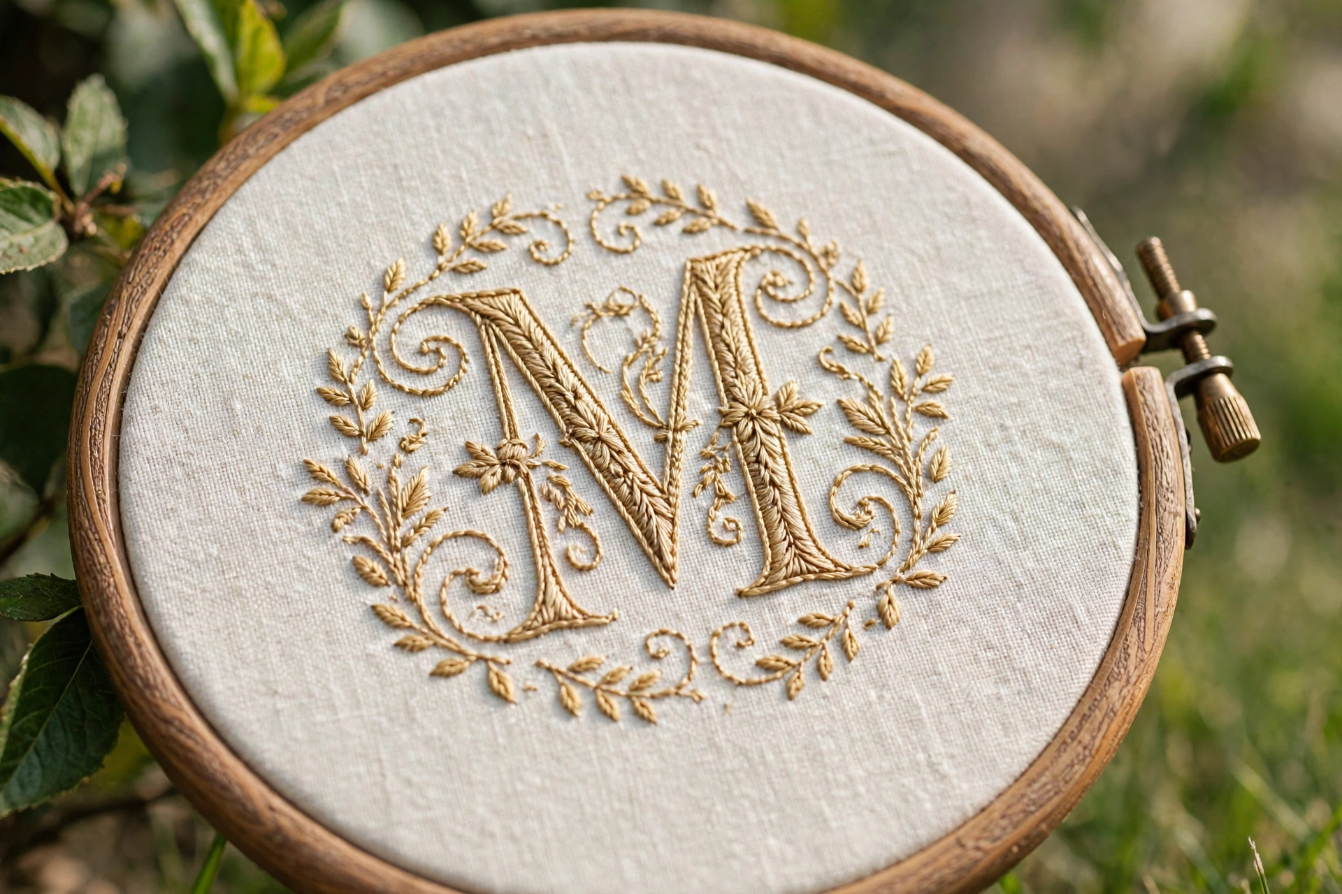
- Serif capitals: Classic and timeless, like the letters on a book cover. The small feet on the letters give your stitches clear start and end points. An excellent first choice.
- Simple script: Flowing and romantic, lovely for wedding pieces. Choose a script with open, generous loops rather than a cramped, fiddly one. Avoid scripts where letters tangle together until you have more experience.
- Block or sans-serif capitals: Clean and modern, great for children’s items, tote bags, and contemporary home decor. Very forgiving to stitch because every line is straight or a simple curve.
- Decorative or vintage styles: Beautiful for special occasions, but save these for your second or third monogram. Fine serifs and delicate hairlines are hard to render in thread at small sizes.
Find your letterforms in a book, a printed alphabet, or a font on your screen. Print or draw the letters at the exact size you want to stitch them, because lettering that looks good large can fall apart small. As a rule, keep your smallest letter at least 1 inch tall. Below that, fine details like thin serifs become nearly impossible to stitch neatly.
Laying Out the Composition
Composition is simply deciding where each letter sits and how the elements relate. A well-composed monogram feels balanced even before you add decoration.
Single letter monograms
Centre the letter both horizontally and vertically in your hoop or design space. Give it generous margins: the letter should occupy roughly the middle 60 percent of the space, with calm empty fabric around it. A single letter loves a frame, so plan for a circle, oval, or wreath around it from the start rather than squeezing one in later.
Two-letter monograms
Place the letters side by side with a small, even gap between them. You can keep them the same size for a modern look, or enlarge one slightly for emphasis. Overlapping the letters a touch, so a curve of one tucks behind the other, creates an entwined, romantic feel that suits wedding and anniversary pieces. Sketch the overlap carefully so the front letter stays clearly readable.
Three-letter classic monograms
Draw the centre surname initial first, large and centred. Then place the two smaller initials to the left and right, aligned to the vertical middle of the large letter. The side letters are typically about two-thirds the height of the centre letter. Step back and check the balance: the three letters should feel like one unit, with even spacing and a shared baseline feel, not three separate stamps.
Adding Flourishes, Frames, and Small Motifs
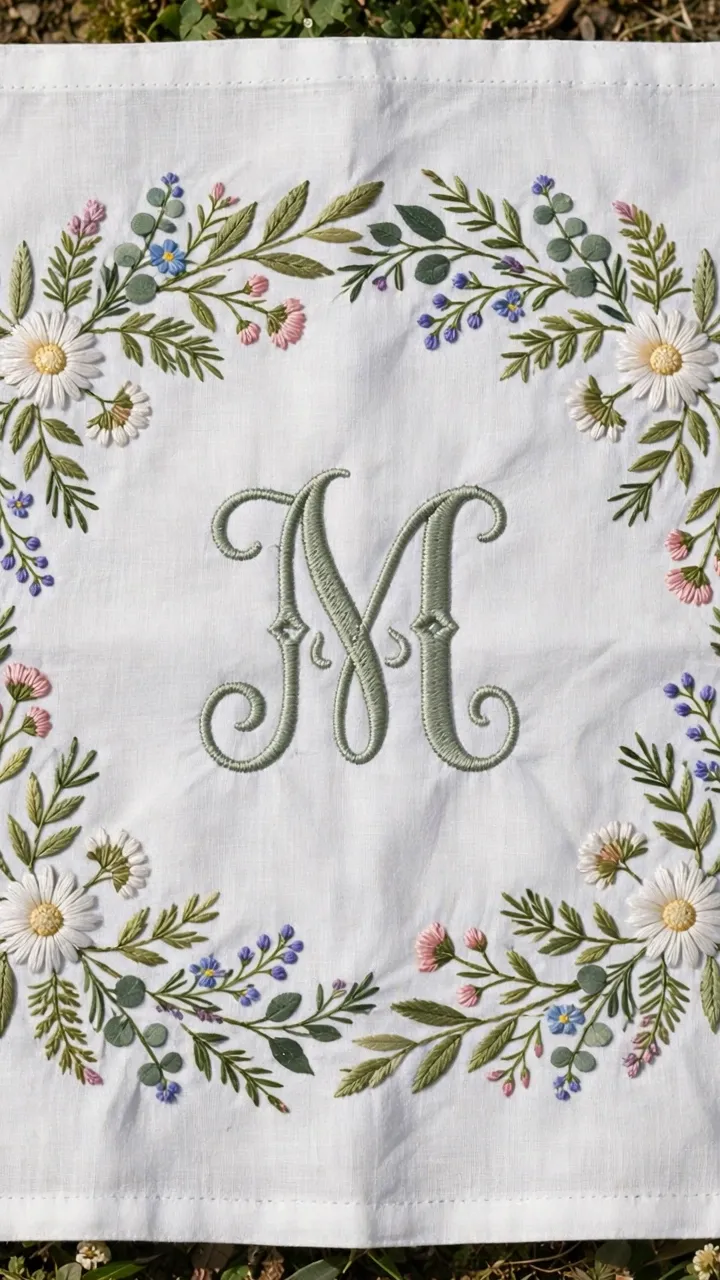
Once your letters sit well together, decoration is what turns a plain initial into a keepsake. The golden rule is restraint: choose one or two decorative elements, not five. A monogram with a frame, a flourish, a flower, a bow, and dots underneath looks cluttered. A monogram with a simple wreath and one small flower looks elegant.
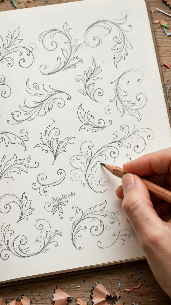
- Flourishes: A single curved line sweeping under or around the letters adds grace. Draw it as one confident stroke on paper first. In thread, a smooth stem stitch or split stitch follows your drawn curve beautifully.
- Frames: Circles and ovals are the classic monogram frames. A double circle, one thin line inside a slightly bolder one, looks refined. Keep the frame at least a quarter inch clear of the letters all the way around.
- Wreaths and sprigs: A ring of small leaves or a laurel sprig beneath the letters suits botanical and wedding themes. Lazy daisy stitches make perfect little leaves with minimal effort.
- Small motifs: A tiny flower, a heart, a star, or a bee tucked near the letters personalises the piece. Match the motif to the recipient: a heart for a partner, a small flower for a friend, a star for a child.
- Dots and dividers: A row of French knot dots or a short divider line between letters in a two-letter monogram adds a finished, jeweller-like touch.
Transferring Your Monogram to Fabric
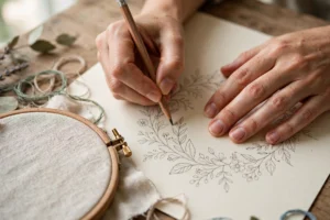
Because monograms depend on crisp, accurate lettering, take extra care with the transfer. A wobbly transferred line becomes a wobbly stitched letter.
- Finalise your design on paper at the exact stitching size. Darken all lines so they are clearly visible.
- Choose your transfer method. A light box or a sunny window with the fabric taped over your paper works well for light fabrics. For dark fabrics, use a white water-soluble pen to trace the design, or use dressmaker’s carbon paper.
- Transfer only the essential lines: letter outlines, frame lines, and the placement of motifs. Fine inner details are easier to judge by eye while stitching.
- Check the transfer against your paper original before you start stitching. Letters are unforgiving of mirroring mistakes, so confirm every letter faces the right way and sits in the right order.
Stitching Your Monogram: The Best Stitches
Three stitches cover almost every monogram you will ever make. Master these and your lettering will look clean and professional.
Stem stitch for outlines and flourishes
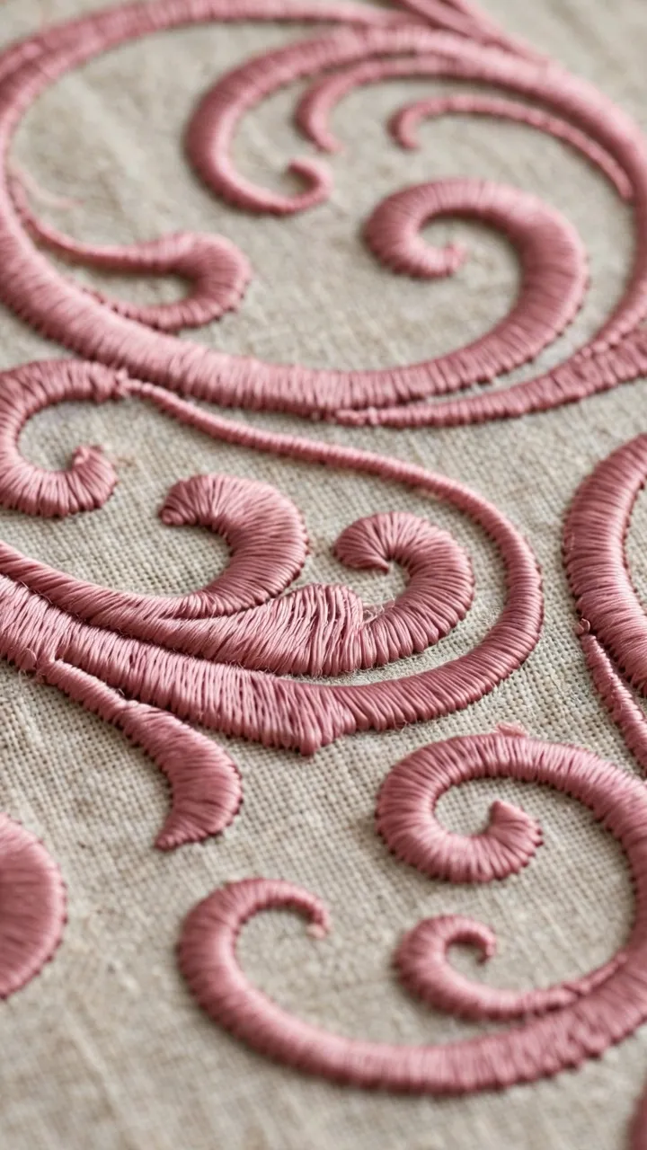
Stem stitch creates a smooth, slightly rope-like line that follows curves beautifully, which makes it ideal for letter outlines and decorative flourishes. Keep your stitches small and even, around an eighth of an inch, and always keep the working thread on the same side of the line so the twist stays consistent.
Split stitch for fine lines and small letters
Split stitch gives a fine, textured line that suits small letters and delicate details. It also makes an excellent outline to stitch first around areas you plan to fill, because it creates a crisp edge that keeps the fill tidy.
Satin stitch for filled letters
When you want a letter filled solid, satin stitch is the classic choice. Work from the middle of each stroke outward, or outline the shape in split stitch first and then fill. Keep every stitch parallel and close together, and do not pull tightly or the fabric will pucker. For wide letter strokes, consider padded satin stitch: lay a foundation of straight stitches first, then satin stitch over them for a lovely raised effect.
French knots for dots and accents
Use French knots for the dots on letters like i and j, for decorative dot rows, and for flower centres in your motifs. Two wraps around the needle is the sweet spot for most monogram work.
Choosing Thread and Colours
Monograms traditionally use one or two colours, and this restraint is part of their elegance. A single colour in a good-quality stranded cotton gives a classic look: deep navy, forest green, burgundy, or gold on white or cream fabric never fails. For a modern piece, try tone-on-tone stitching, like dusty rose thread on blush fabric, for subtle sophistication.
If you use two colours, let one dominate. Stitch the letters in the main colour and reserve the second colour for the frame, the motif, or small accents. Use two to three strands for letters an inch or taller. For smaller letters, drop to one or two strands so the details stay crisp.
Mistakes to Avoid
- Choosing a fiddly font. Hairline serifs and tangled script look gorgeous on screen and terrible in thread at small sizes. Start with a clear, open lettering style and save the fancy fonts for later.
- Stitching letters too small. Below about 1 inch tall, letters lose the detail that makes them readable. If your design space is small, use fewer letters or a simpler style rather than shrinking a complex one.
- Overdecorating. Every extra flourish competes with the letters for attention. Pick one frame or one flourish or one motif, and let the letters be the star.
- Uneven letter spacing. In two and three-letter monograms, inconsistent gaps look accidental. Measure the gaps on paper and keep them equal.
- Mirrored or misordered letters. Check your transfer against the original, especially with carbon paper or window tracing where flipping is easy. A backwards initial ruins the piece.
- Pulling satin stitch too tight. Tight stitches pucker the fabric and make letters look pinched. Keep an even, gentle tension and let the stitches lie flat on the surface.
- Skipping the outline before filling. Filling a letter with satin stitch and no outline often gives wobbly edges. A split stitch outline first acts as a guide rail for a crisp fill.
Gift Ideas for Your Finished Monogram
A finished monogram deserves a good home. Frame it in the hoop you stitched it in for an instant gift, or sew it into a lavender sachet, a bookmark, or the corner of a handkerchief. Monogrammed napkins make a beloved wedding gift, and a child’s initial on a nursery hoop is a keepsake parents treasure for years. Whatever you make, add a small tag or note with the date: handmade monograms become heirlooms, and future generations will love knowing when yours was stitched.
Designing your own monogram pattern is deeply satisfying because the result is unmistakably yours, or unmistakably theirs. Start with one clear letter, a simple frame, and your three trusty stitches. Keep the decoration restrained, the letters readable, and the tension gentle. Then step back and admire a piece of stitching that no shop could ever sell, because it was made for exactly one person. Happy stitching.