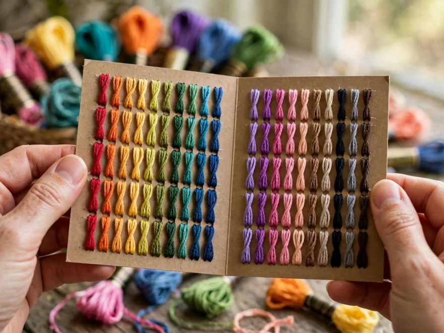
I bought the DMC floss color card in 2021 for $32, unfolded it, stared at 500 tiny thread samples in an order that was clearly not the rainbow, and used it as a bookmark for six months. It intimidated me. Now it is the most-used tool in my studio. I reach for it more than any stitch dictionary, because once you crack the system it becomes a palette planner, a substitution guide, and a shopping list in one. Here is the whole system, no memorization required.
The numbers are historical, not logical
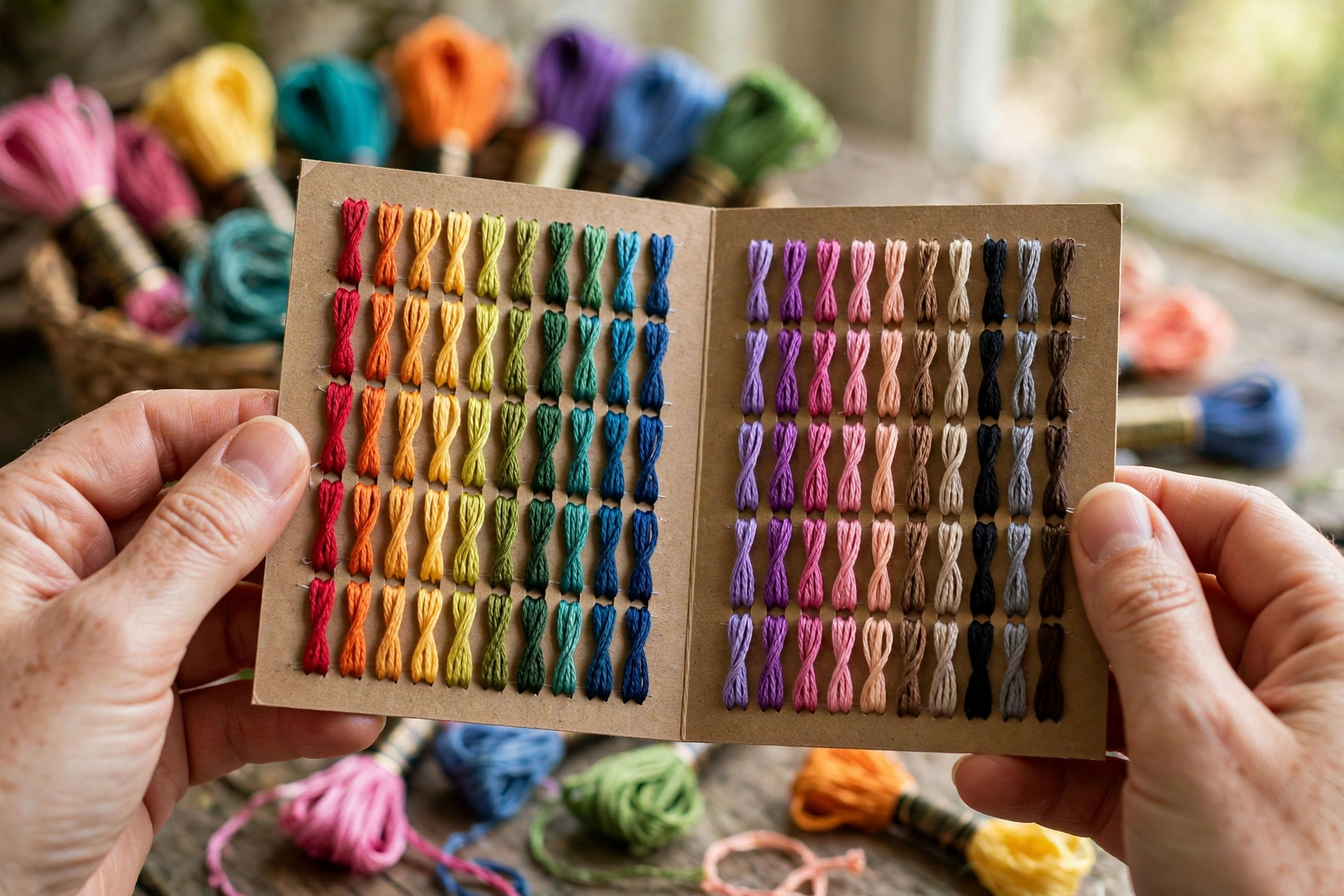
The numbers look random because they are. New colors got the next available number as DMC introduced them over more than a century, so there is no grand logic to decode. But families cluster together, and those clusters are all you need. A color card shows real thread samples, not printed ink, next to every number, which is why the physical card beats any screen. Monitors lie about color. Every single one.
The anchor numbers worth memorizing
You do not need all 500. Learn these landmarks and you can navigate the whole card:
- 310 is black. Blanc is white. These two are your constant north stars.
- 321 and 666 are the classic reds. If a pattern says “red” without thinking, it usually means one of these.
- The 700s are bright clear greens, the cheerful leafy ones.
- The 800s are the Delft blues, walking from deep navy down to pale blue.
- The 300s are warm browns, coffee and bark tones.
- The 4000s are variegated threads, the ones that shift color along the strand.
Within a family, shades usually run light to dark. That single fact is the key to everything below.
The progression trick, with a real example
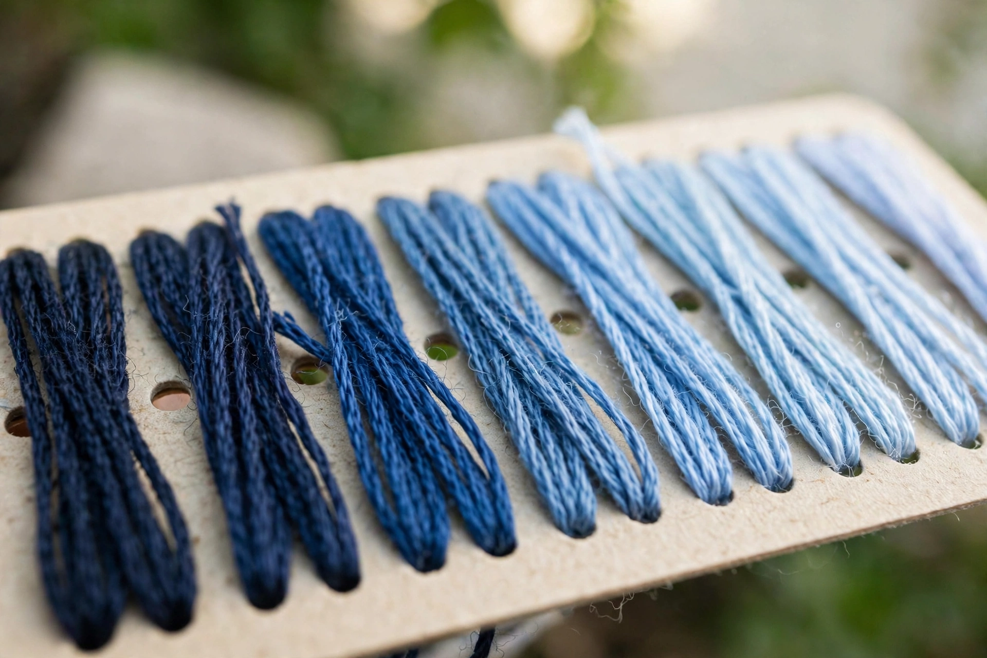
Pick any family on your card and look at five neighboring samples. Same hue, stepping from light to dark. That progression is the secret to smooth shading, and reading it is the highest-value skill in this post.
Here is exactly how I used it last month on a poppy cushion. The pattern needed three reds. Instead of grabbing three random reds, I found my main shade on the card, DMC 321, then looked at its immediate neighbors. One step darker was 815, one step lighter was 352. Three skeins, one family, and the petals shaded themselves with zero guesswork. When a pattern calls for three greens, it wants three steps from one family, not three greens that happened to be on sale.
The rule: locate your main shade, take the closest lighter and darker neighbors. Those are almost always the intended companions. One more thing the card taught me: match value (lightness) before hue when substituting. A slightly wrong blue at the right lightness looks more correct than the perfect hue at the wrong lightness.
Planning a palette with your floss color card
This is my actual process, start to finish.
- Lay the card flat in natural daylight. Warm lamplight drags every color toward yellow and your palette will lie to you.
- Find your anchor color first: the dominant shade of the design, like the main flower color.
- Walk its family on the card and pull one lighter highlight and one darker shadow shade.
- Audition contrast colors from neighboring families right on the card. No purchase necessary.
- Buy only the shortlist, then lay the real skeins on your actual fabric. Thread next to fabric surprises people constantly.
- Stitch a small test swatch. Colors blend optically when stitched; the swatch is the only honest preview. Thread packed into satin stitch reads darker, open stitches read lighter.
Your screen is lying to you
Digital charts are handy for checking a number fast or shopping online, but never finalize a palette from a screen. Every display renders color differently, printed pattern PDFs shift colors too, and even two dye lots of the same DMC number can vary slightly, which is why big projects should use skeins from the same dye lot. The physical card with real thread is the reference. Everything else is an approximation, including the photo at the top of this post.
Start small if the full card overwhelms you: pick one family and three shades. Constraints make better palettes than infinite choice. And check the print date on your card. Colors get added and discontinued, and a ten-year-old card will be missing newer shades your patterns reference. Mine is the 2021 printing, and I have already penciled in three new numbers in the margins. When a pattern calls for a number your card does not have, check the DMC website for the current range before assuming the pattern is wrong. It is almost never the pattern.
One comment