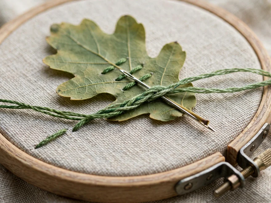
My first attempt to blend thread colors was a sunset I stitched for my kitchen wall in 2021. I used three flat bands, dark orange, medium orange, yellow, with hard edges between them like a traffic flag. A friend who does thread painting looked at it, said “you have to mix them in the needle,” and changed my stitching life in one sentence. To blend thread colors, you put strands from two or more skeins through the needle at the same time, so the colors mix inside the stitching itself instead of sitting in stripes. It is the difference between a coloring book and a painting, and it is far easier than it looks.
What thread blending actually means
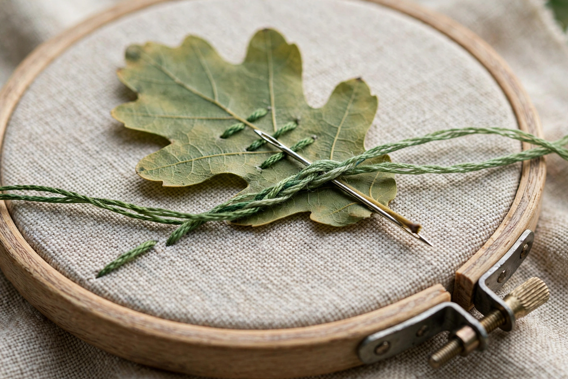
A skein of DMC floss has six strands. Normally you pull out two or three strands of one color and stitch with those. Blending means you pull, say, one strand of dark green and one strand of medium green and stitch with both together. From a foot away the eye reads it as a brand-new in-between color. From six inches away it reads as texture. Either way it reads as intentional, which flat bands of color rarely do.
This is not a new trick. DMC itself has published blending charts for decades, and thread painters have built entire careers on it. But beginners tend to assume shading requires buying forty-seven skeins in a perfect gradient. It does not. Three skeins and a willingness to mix will shade anything.
Picking colors that actually blend
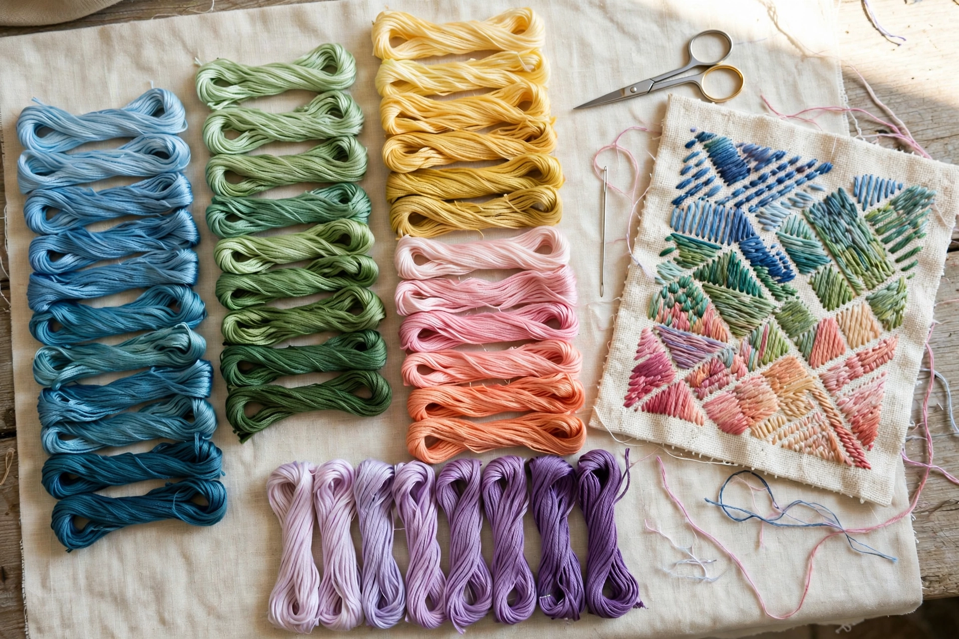
The rule is simple: blend neighbors, not strangers. Pick colors that sit next to each other in the same family, like DMC 3346, 3347, and 3348, three greens that step from medium to dark. The DMC numbering is your friend here, because consecutive numbers in a family are designed to step gradually. My floss color card guide explains how to read those progressions, and it will save you from buying colors that look related in the skein and fight on the fabric.
The squint test is the fastest check I know. Lay your candidate skeins side by side and squint until they blur. If they melt into one continuous tone, they will blend. If you can still see distinct bands while squinting, the jump is too big and the finished shading will stripe. I do this in the shop aisle and I do not care who watches.
One warning: blending complementary colors, like orange and blue strands in one needle, does not make a pretty in-between. It makes mud. Lovely, textured, brownish-gray mud. Keep your blends inside one color family until you know exactly what you are doing.
The strand combinations that work
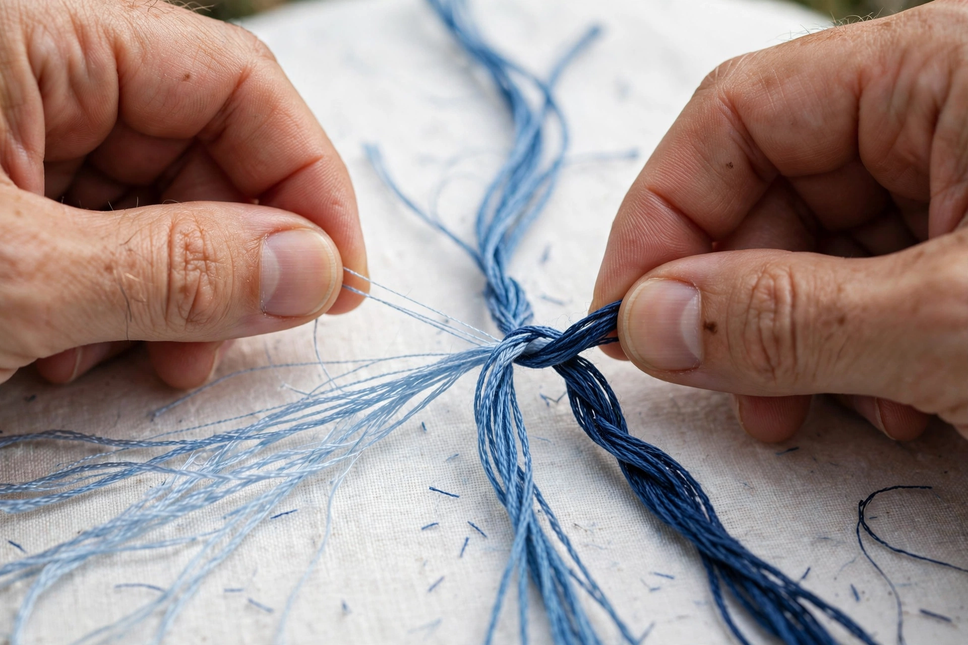
With two strands in the needle, the classic combos are 2+0 (pure color), 1+1 (the true blend), and then back to 0+2. That gives you three tones from two skeins. With three strands you get finer steps: 3+0, 2+1, 1+2, 0+3, which is four tones from two skeins and a beautifully gradual run. I do most of my shading with three strands for exactly this reason. The math is free and the gradient is smoother.
For a long gradient, say a petal running from deep rose at the base to near-white at the tip, plan it in writing first. I literally write the combos in the margin of my pattern: 3 dark, then 2 dark 1 medium, then 1 dark 2 medium, then 3 medium, and so on through the light. Five minutes of planning beats an hour of unpicking a gradient that jumped too fast. Keep your floss sorted by family while you work, because mid-blend is the worst time to go digging through a bag for the next shade.
Long and short stitch is the vehicle
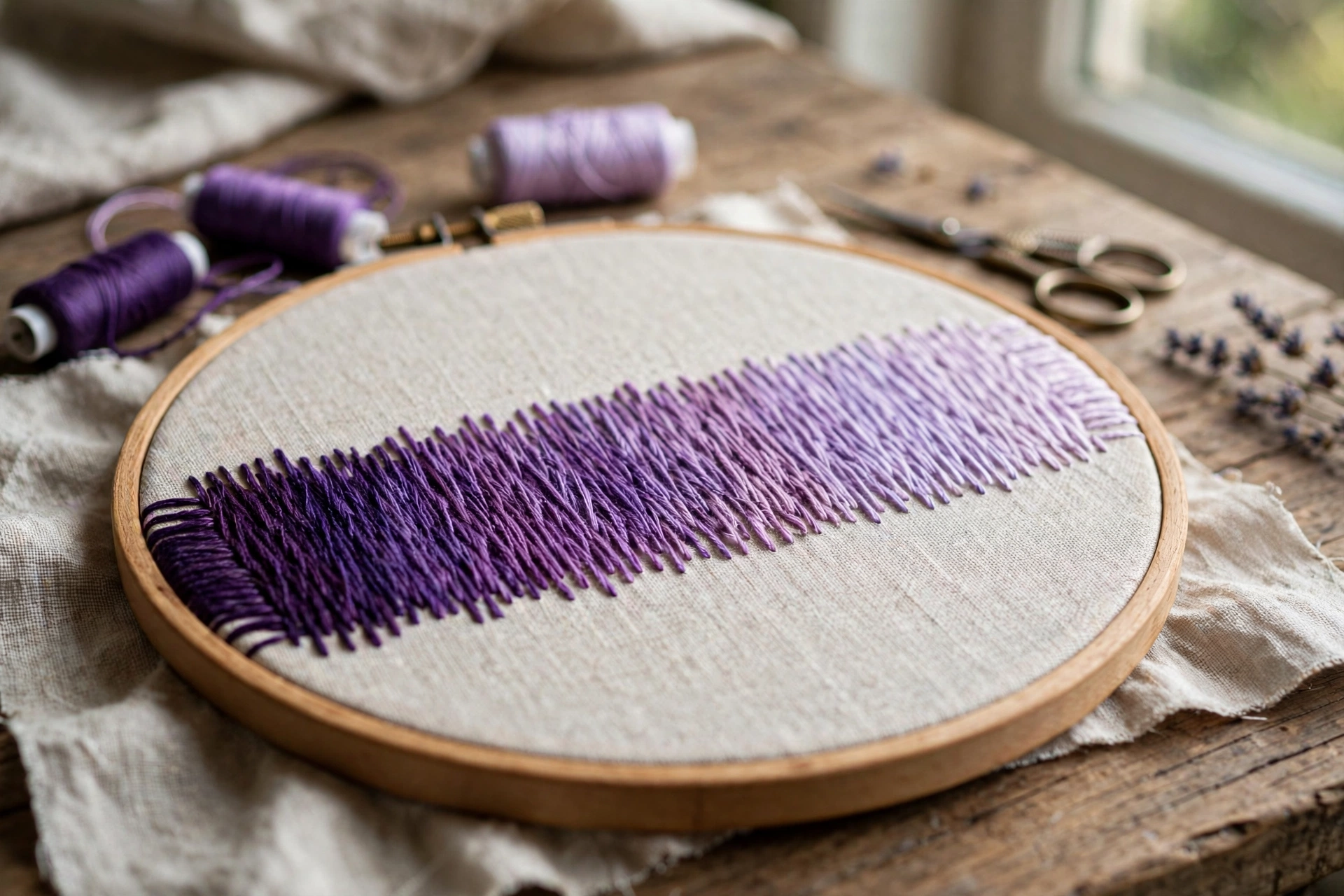
Blending lives inside long and short stitch, the filling stitch where rows of staggered stitches overlap like shingles. Flat satin stitch shows every color change as a line. Long and short stitch lets the rows melt into each other, which is the whole point. My satin stitch filling guide covers the base technique, and everything there applies, with one addition: stagger the row lengths randomly. Uniform rows create a subtle corduroy effect that fights the blend. Random lengths disappear into the gradient.
Direction matters enormously. All stitches in a blended area should follow the same flow, following the shape the way hair grows on an animal or veins run in a leaf. Stitches going in different directions catch the light differently, and that alone can break a blend that was perfect on paper. I once shaded a leaf with the top half stitched tip-to-base and the bottom half base-to-tip, and the seam between them looked like a fault line.
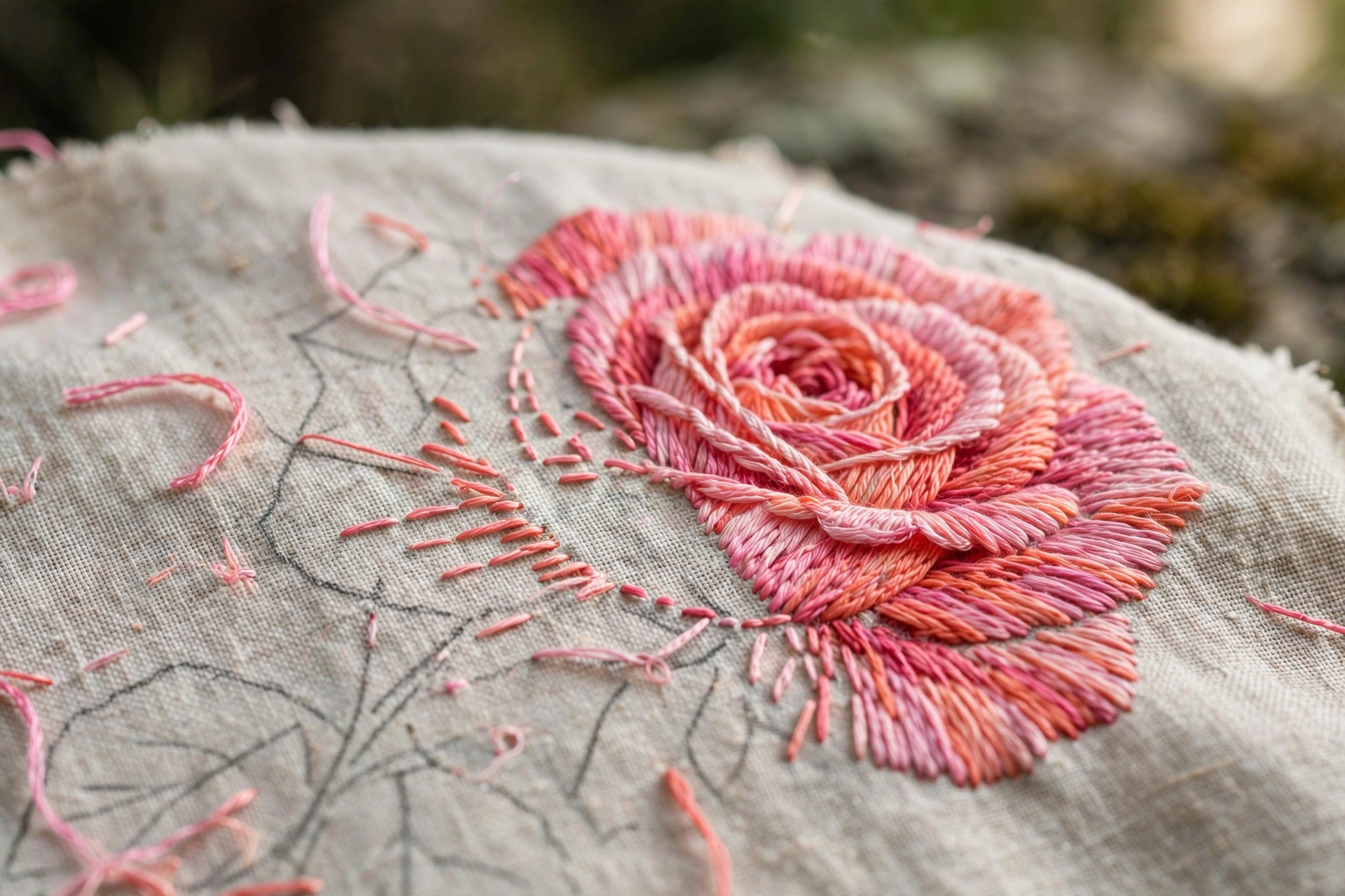
Stitching the gradient, row by row
Start with the darkest tone at the shadow edge or the base of the shape. Work the first row in long and short stitch, then change one strand for the next row, then another, walking through your planned combos. Do not finish one color completely and then start the next. Overlap them. The transition rows, where old and new share the needle, are what make it look gradual instead of banded.
Stitch a test swatch first, always. A two-inch strip of your planned gradient on scrap fabric takes ten minutes and answers every question: are the steps gradual enough, does the blend read at arm’s length, did you pick the right strand count. I have skipped the swatch exactly twice. Both pieces got frogged. I do not skip the swatch anymore.
Mistakes that break a blend
Jumping too far between colors. If you can name the exact line where one color becomes another, the jump was too big. Add an intermediate blend row. The fix is always more steps, never fewer.
Blending under the wrong light. Two colors that blend beautifully under daylight can stripe under warm lamplight, because warm light shifts reds and yellows. Check your gradient under the light you will actually view the piece in. My daylight vs warm light guide is the full rant on this.
Mixing strand counts mid-blend. Two strands in one row and three in the next changes the texture, and texture differences read as color differences. Pick a strand count and marry it for the whole shaded area.
Overthinking the plan. Yes, plan the combos. No, do not agonize for an hour. Blending is forgiving precisely because the eye averages everything at viewing distance. Get the neighbors right and the rest takes care of itself.
Where blending earns its keep
Flowers are the obvious candidate: rose petals, sunflower centers, any petal with depth. But the trick shines anywhere light falls on a curve. Animal fur, fruit, faces, water, skies. I blended a gray cat last winter with four skeins, DMC 413 through 415 plus Blanc, and people assumed I owned twice the floss I do. That is the economics of blending: a small stash that behaves like a big one.
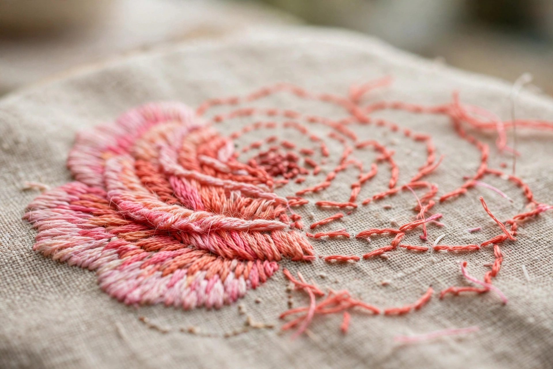
Start small. One leaf, three greens, three strand combos. When that leaf looks like it has actual dimension, you will never stitch a flat fill again without feeling like something is missing. And once your shading is smooth, the next frontier is keeping every stitch the same size, because even stitches make blends look twice as professional.