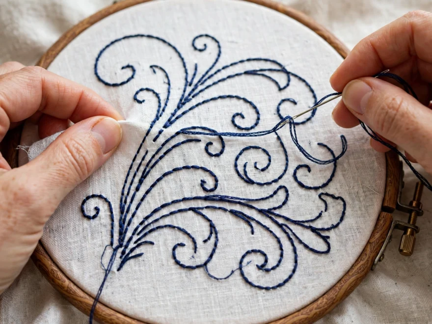
I stitched “love” on a wedding gift in 2020 and the final e leaned so hard it looked drunk. The couple displayed it anyway, which tells you everything about their kindness and nothing about my lettering. Learning how to embroider letters that look neat took me another dozen projects, and it turned out the secret was never in my hands. It was in the preparation, the stitch choice, and three spacing rules I had been ignoring entirely.
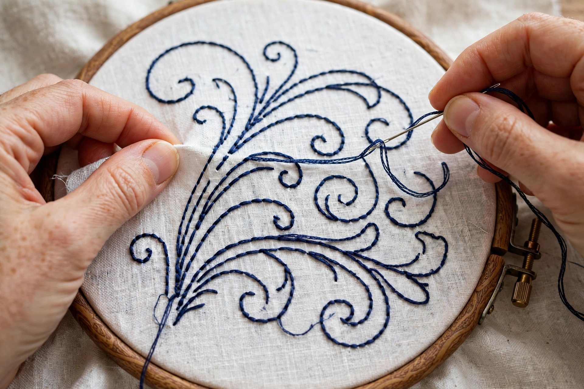
How to embroider letters: transfer is 70 percent of neatness
Here is the uncomfortable truth: most wobbly embroidered letters were doomed before the needle came up. If your guideline is shaky, your stitches will be shaky, because even perfect stitching can only follow the line it is given. Neat lettering starts at the transfer stage, not the stitching stage.
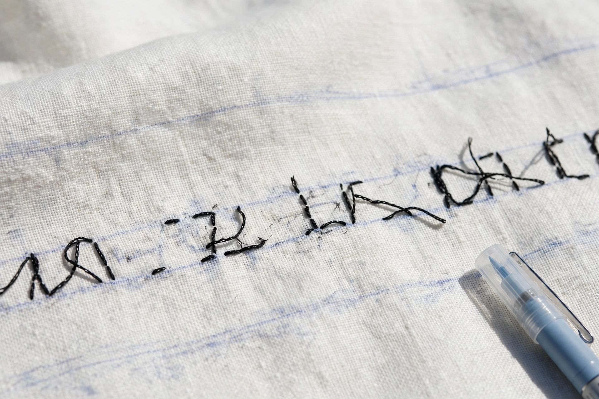
Print your text at the exact size you want it, in a font you actually like. Hold it against the fabric and check the size twice, because letters that look right on screen shrink psychologically the moment they are on cloth. I trace with a water-soluble pen using a lightbox, which is a $25 piece of plastic that has improved my lettering more than any stitch tutorial. No lightbox? Tape the printout and fabric to a sunny window. It works embarrassingly well.
Mark two horizontal guidelines, one for the cap height and one for the baseline, and actually stitch to them. Freehanding the baseline is how the drunk e happens. The guidelines wash out later. Your dignity does not have to.
Pick the right stitch for the letter style
Different letters want different stitches, and mismatching them is the second biggest source of sad lettering after bad transfer.
Backstitch for small, plain lettering
The default choice for anything under half an inch tall. It makes a clean, unbroken line that reads clearly at small sizes. Keep your stitches short, about an eighth of an inch, because long backstitches on curves go polygonal. My basic stitches guide covers the mechanics. 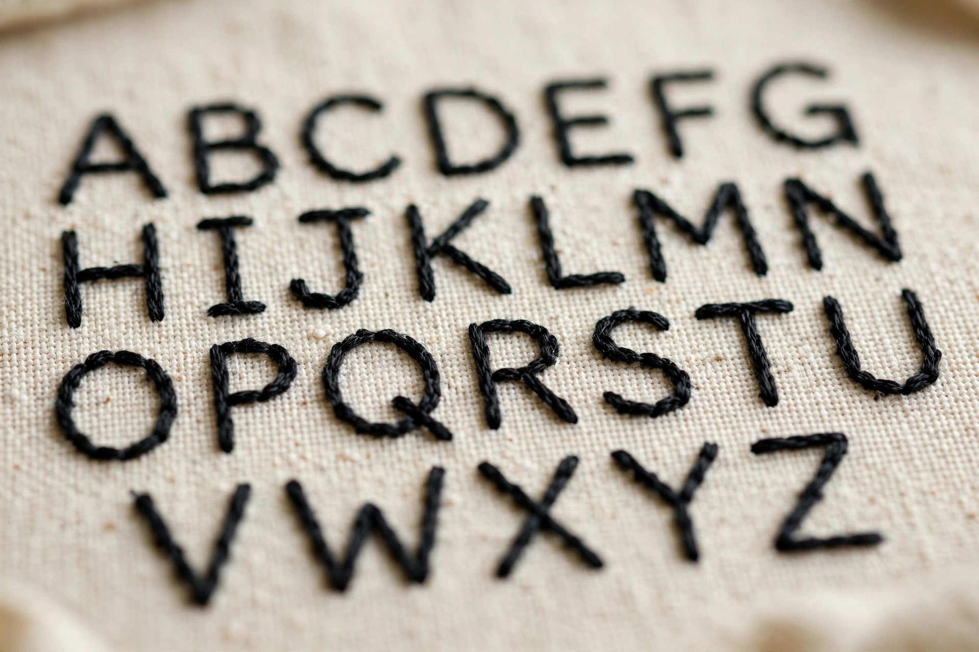
Stem stitch for script and flowing lettering
Script fonts want the rope-like line of stem stitch. It handles curves gracefully where backstitch goes choppy. Keep the thread consistently below the needle (or above, but pick one and marry it) or the line will wobble between smooth and ragged.
Satin stitch for bold block letters
For monograms and statement lettering, fill block letters with satin stitch. Outline first with split stitch, keep the angle consistent, and do not attempt letters taller than an inch without padding underneath. Everything in my gap-free satin stitch guide applies double to letters, because everyone stares at text. 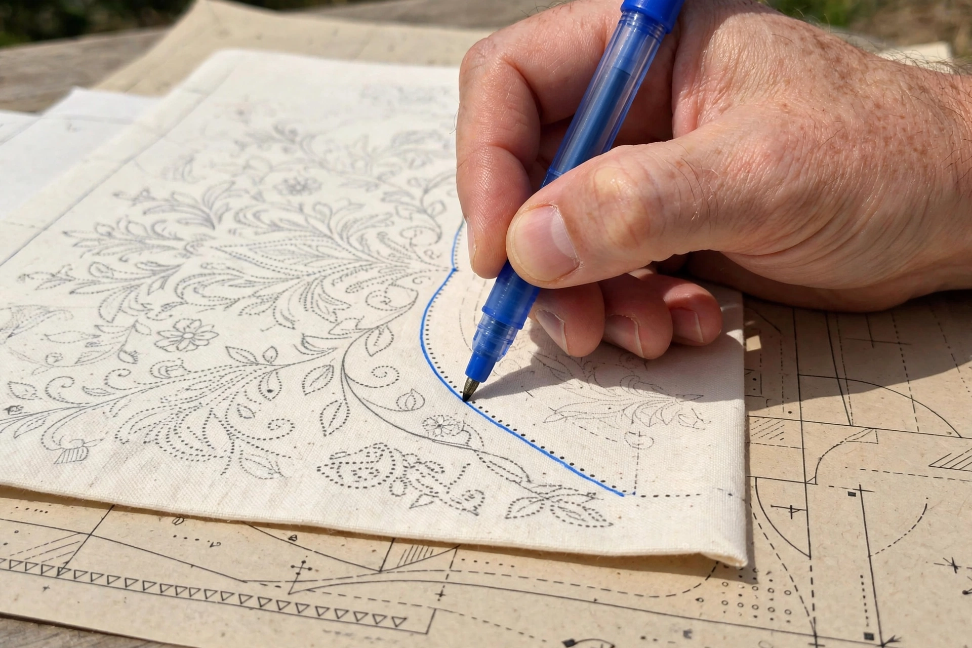
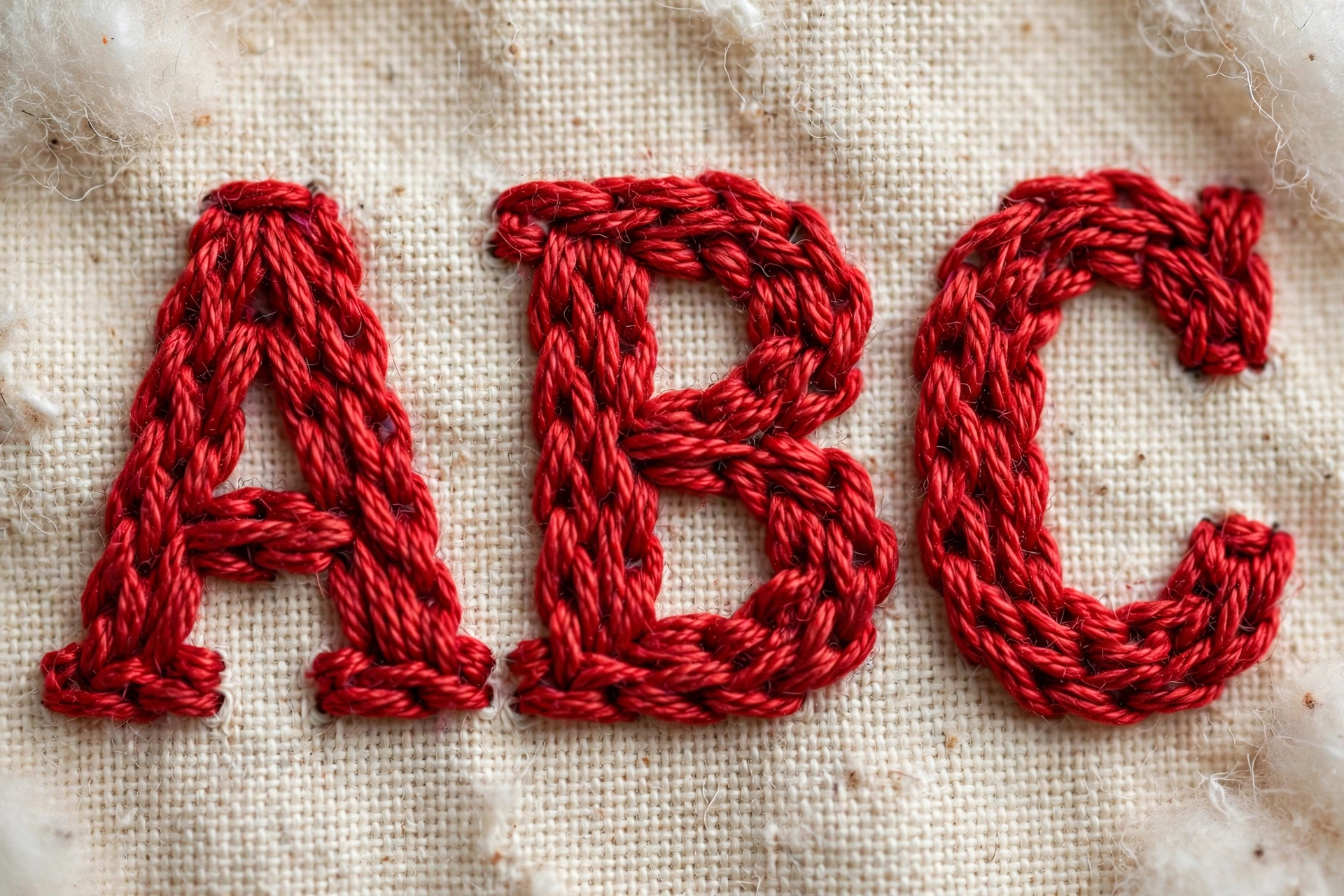
Chain stitch for chunky, casual lettering
Big, bold, friendly letters. Chain stitch gives text a handmade warmth that suits quotes and playful pieces. Keep the loops even or the letters will look like they are vibrating. 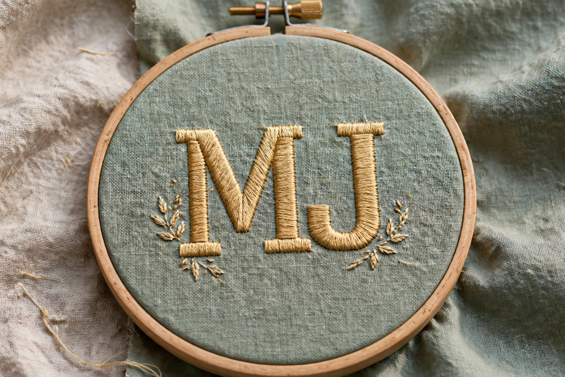
The three spacing rules
Rule 1: letters need consistent x-height. The x-height is the height of your lowercase letters, and it must not wander. Mark it. A wandering x-height is the single fastest way to make lettering look amateur, faster than wobbly lines. One stray tall letter in a row of short ones draws every eye in the room.
Rule 2: space by eye, not by ruler. Round letters like o and c need slightly tighter spacing than straight letters like l and t, or the gaps look uneven. This is called optical spacing, and typesetters have done it for centuries. Trust your eye over your measuring tape. If it looks even, it is even.
Rule 3: mind the slant. If your script leans, every letter leans the same amount. Draw a few faint slant guidelines at your chosen angle and check each letter against them. Mixed slants look accidental. Consistent slant looks like style.
Curves, corners, and damage control
On curves, shorten your stitches. A curve stitched in long straight segments looks like a stop sign trying to be a circle. Eighth-inch stitches on tight curves, no exceptions. On sharp corners, like the top of an A, place one tiny stitch right at the point before continuing, so the corner stays crisp instead of rounding off.
When a letter goes wrong mid-word, do not keep going and hope. Unpick back to the last good letter. I know it hurts. I have unpicked the word “forever” three times on a single anniversary piece, and the fourth attempt was the one worth framing. Alternatively, if the mistake is small and the piece is casual, a well-placed french knot covers a multitude of sins. A flower dot over a wobble is not cheating. It is design.
One more practical note: use 2 strands for most lettering, 1 strand for anything under a quarter inch tall. More strands at tiny sizes just make mud. And choose your floss deliberately. A variegated thread looks gorgeous on script and chaotic on block letters, a distinction I learned on a Christmas stocking that is now a family joke. My floss color card guide helps with picking shades that behave.
Neat lettering is preparation plus the right stitch plus three spacing rules. None of it is talent. The drunk e and I both eventually sobered up, and your letters will too. For historical reassurance that humans have obsessed over this for centuries, the embroidery article is a rabbit hole worth falling into, preferably with a hoop in your lap.
One comment